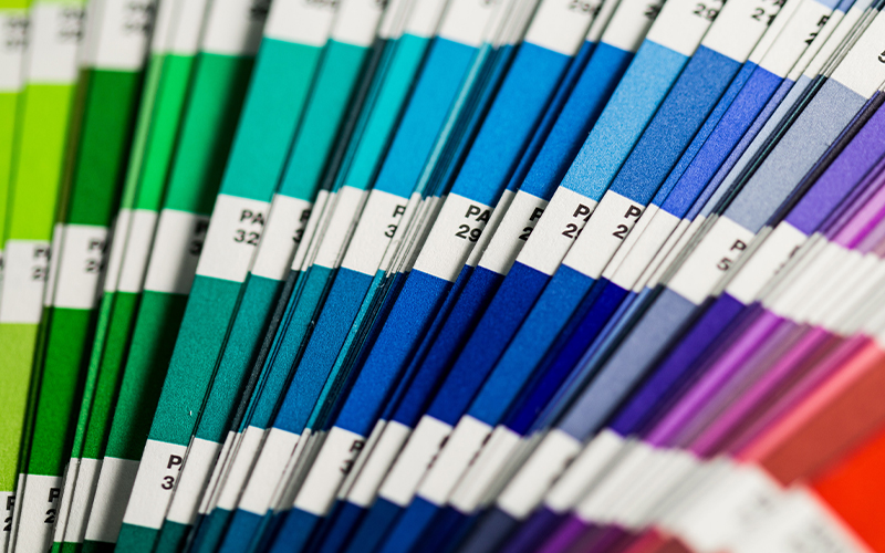
Color is an integral part of our everyday lives. Even if we don’t notice a certain color, it is still there, creating the background or the mood of visual elements through its interplay with brightness, warmth and contrast. The power of colors lies in the emotions that they evoke within us; it is all about how we feel and think when seeing them. Colors have been historically assigned specific meanings to them, as well as studied biologically based on the reactions of various organisms.
Every year people who work closely with colors try to predict what will be the newest color trends based on their observation of events within society, technological fads, and psychological characteristics of people. By and large, in 2021 the trending colors will be calming and oriented towards our comfort.
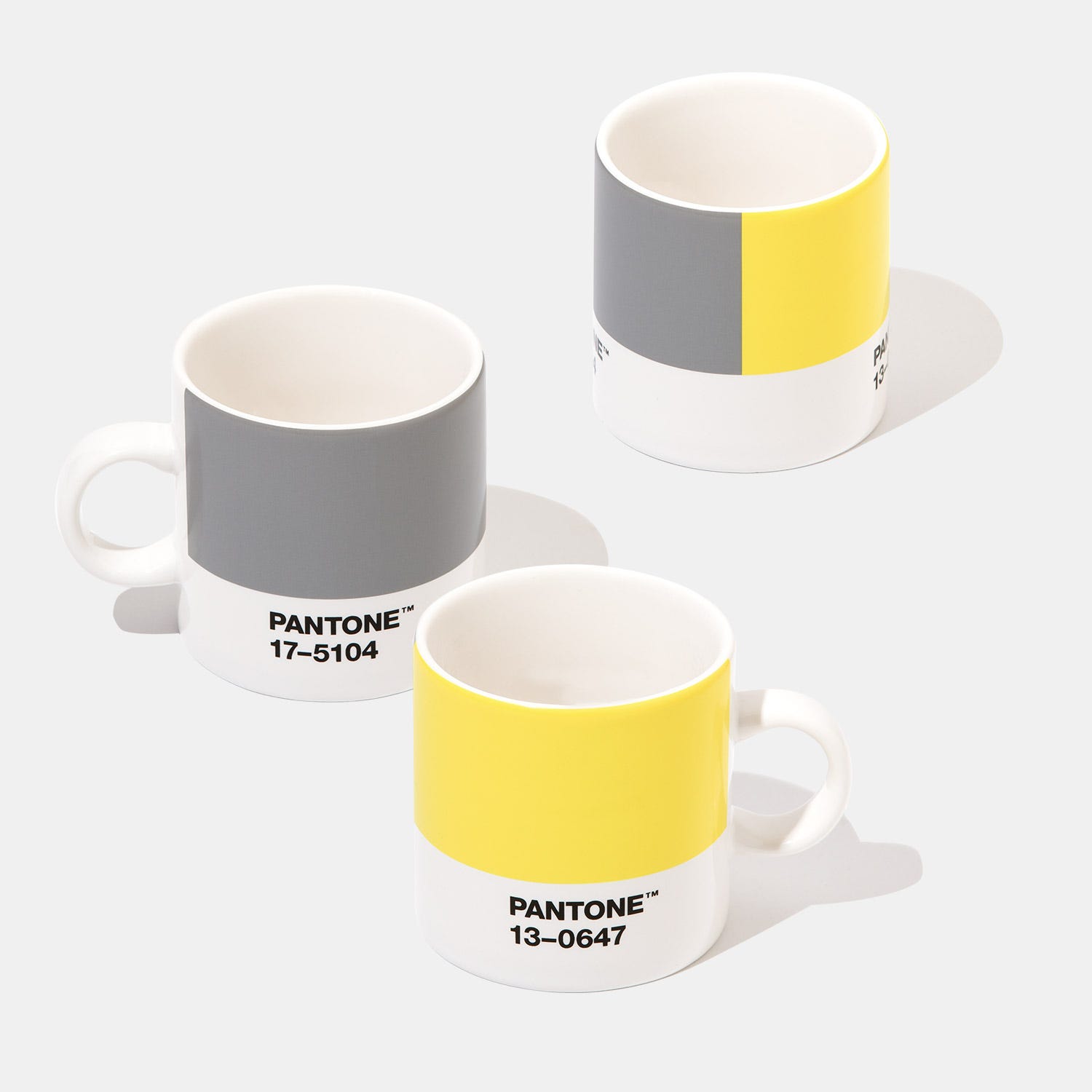
Each winter, the world’s design agencies share their color choices for the next year. Pantone, one of the leading companies in this field, have even named two for 2021 – it is a duet that could be described as ‘light at the end of the tunnel’ – PANTONE 17-5104 Ultimate Grey (concrete grey) and PANTONE 13-0647 Illuminating (warm sunset yellow). Only once before have the experts of Pantone Color Institute granted this honor to two colors at the same time. Firm and practical, but simultaneously warm and optimistic – this is a color combination that gives us perseverance and hope.
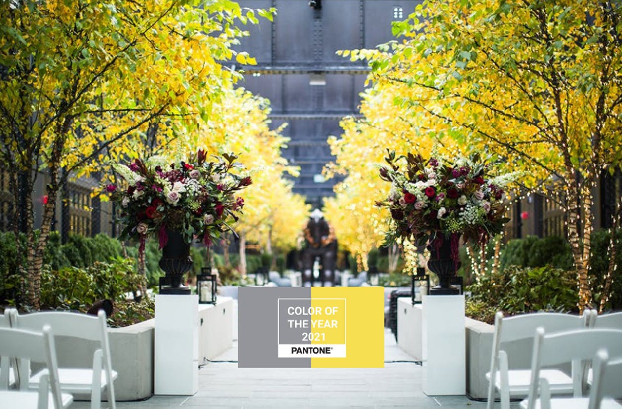
These are two independent colors that highlight a connection between different elements with the aim of supporting one another. This is exactly what best expresses the color mood of 2021 – an optimistic combination of strength and positivity.
It is a color story that contains feelings of deeper thought and a promise of friendship and sunshine. A message of happiness united by trust.
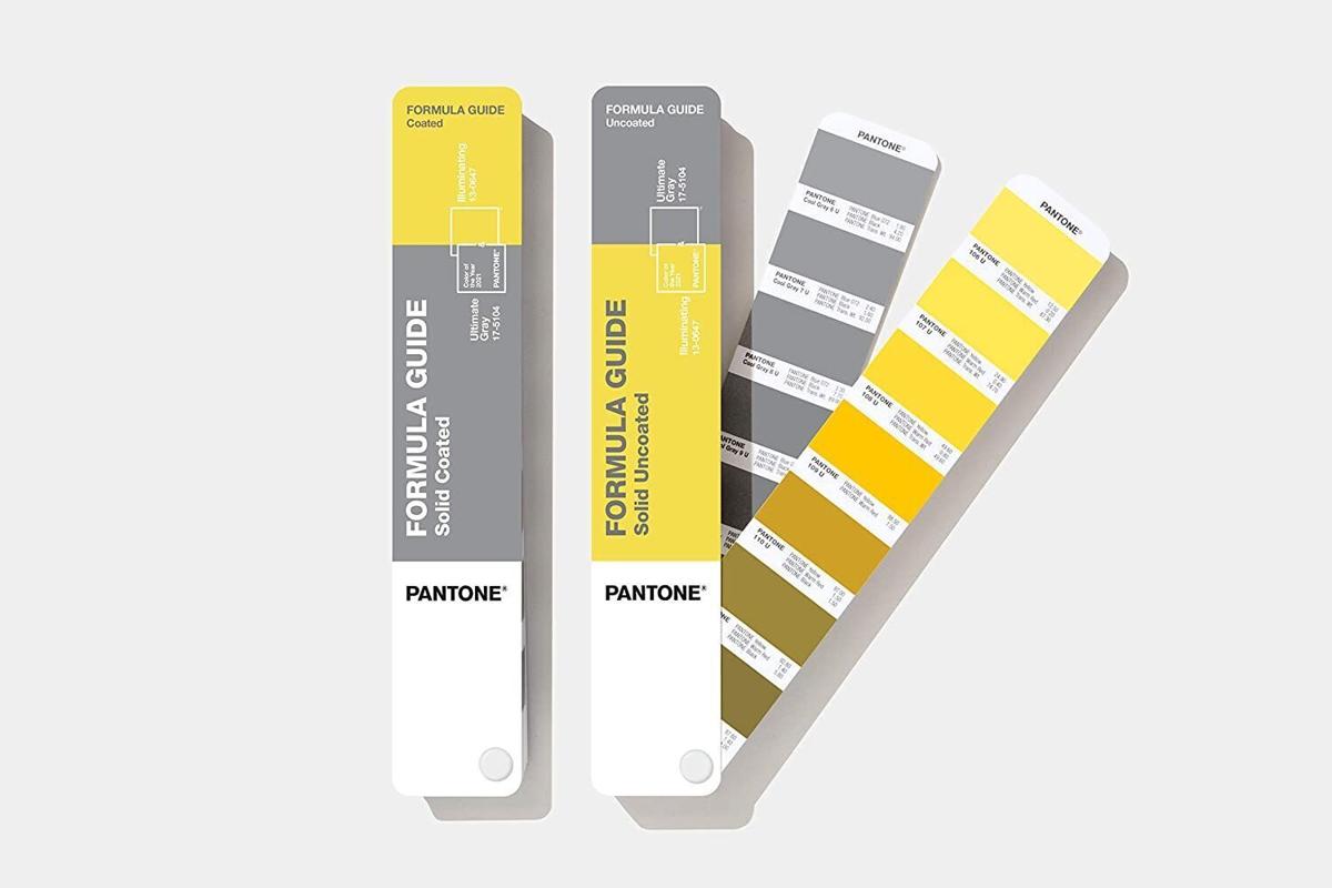
The Ultimate Gray (17-5140) is a color that inspires composure, reliability, and endurance. It relates to strength and the elements of nature – rocks, pebbles, beach colors – the appearance of which emphasize the ability to withstand the test of time.
The Illuminating (13-0647) is a bright and cheerful shade of yellow that radiates liveliness and warms with its charge of sunlight. When we look for ways to strengthen ourselves with energy, clarity, and hope as well as for how to overcome the constant uncertainty, this energetic and cheery tone will satisfy our longing for vitality.
One of the color trends that will dominate in 2021 is going to be rich, saturated colors in combination with a lot paler tones in the background that will let the heavier colors stand out even more.
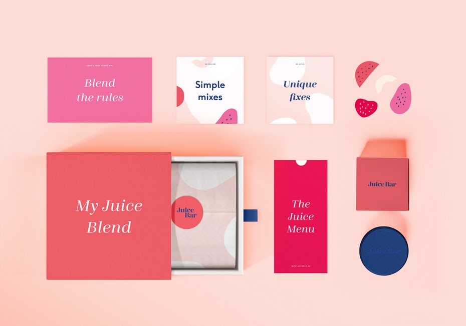
After a year as challenging as 2020, people crave positivity which is why designers are encouraged to offer rosy and orange colors as well as cheerful coral tones, which is something all of us need right now. These rich and lush colors have a rejuvenating and uplifting effect. They are warm but not hot. Refreshing but not obnoxious. In combination with light pink and cream-colored tones they form an intriguing contrast that is pleasant to the eye. The pale background in such designs is just as important as the highlighted color, as it is what makes the main highlight stand out a lot more.
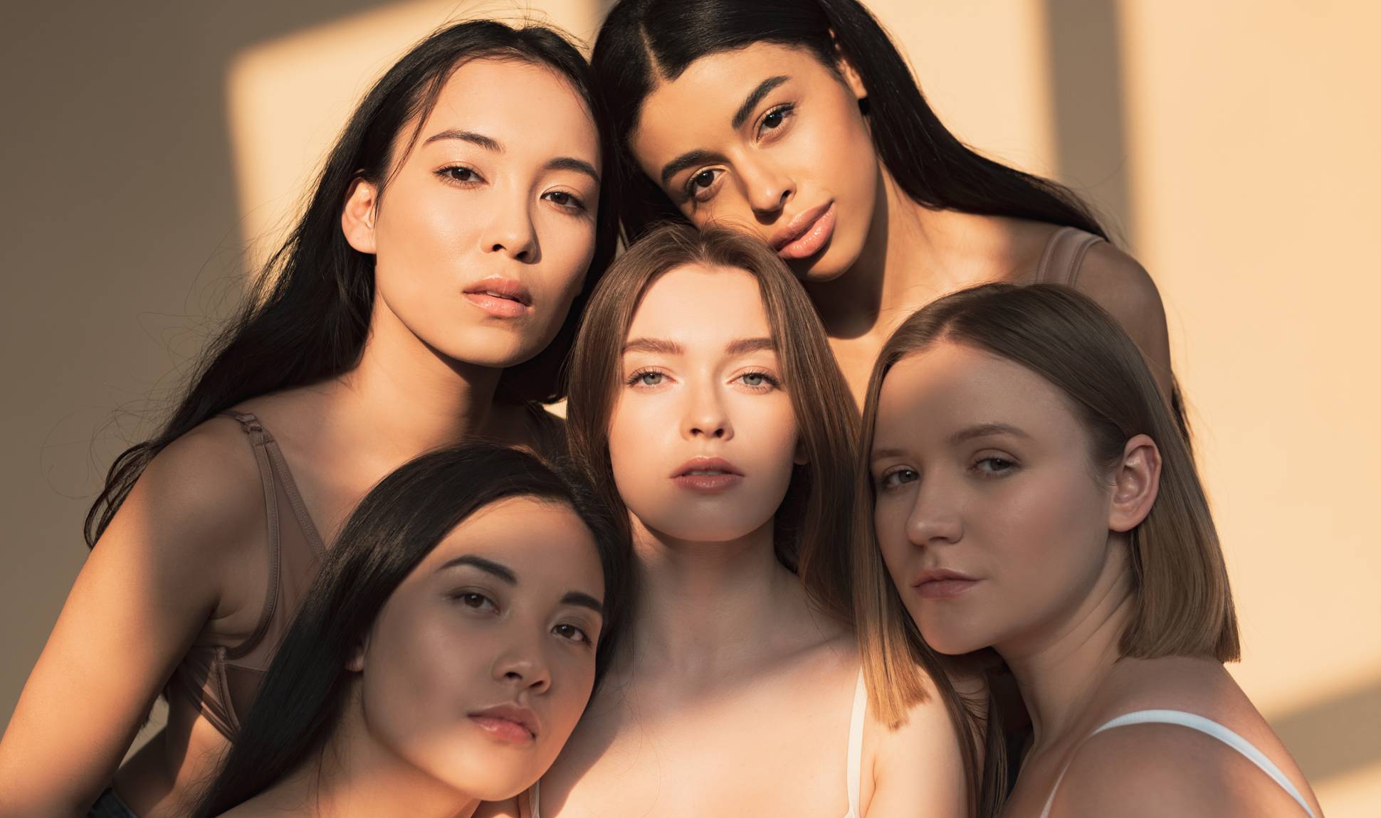
As already mentioned, the color trends of 2021 have very humane characteristics. One of the biggest trends will be color palettes aimed at reflecting the beauty of the human skin. It won’t be the small set of human skin tones that we have seen before, as the designs will work with all the colors of our organic rainbow, often making the close-up of a person the main part of the design.
Instagram is an app where influencers currently in particular favor the neutral color palette. These colors continue to influence the world of design. There was a time when ‘being beige’ was an insult, but now it is the base color of the fashion and interior design industries, becoming increasingly more popular.
In 2021, people will want harmony in their colors as well. We will wish for comfort that comes from unity and togetherness, which will be reflected in the color trends of the latest designs. One of the most expected trends that you’ll see are palettes consisting of tones that are close to each other, easily blending together.
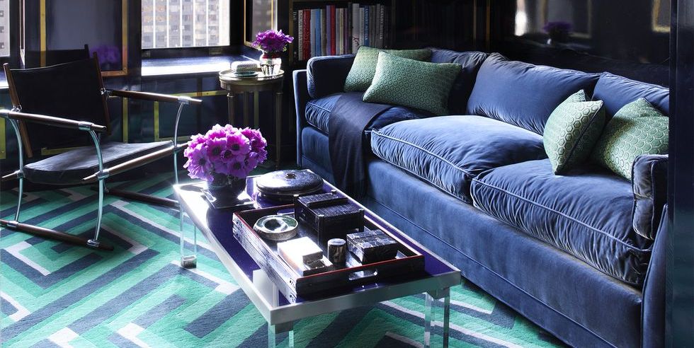
Trends change over time, and it has been noted that the tendency for color transitions that was popular for years before is now turning into a trend towards color palettes of similar tones. Some of these harmonious palettes consist of various shades of the same color, while some are collections of tones that are outside the boundaries of these colors. Either way, these tones create a relaxing effect similar to color blending without perfectly smooth boundaries that we are used to seeing in gradients.
The harmonious and positive feeling inducing list of colors for 2021 is also joined by designs where colors are used in unexpected, even surreal ways, thus creating dreamlike images.
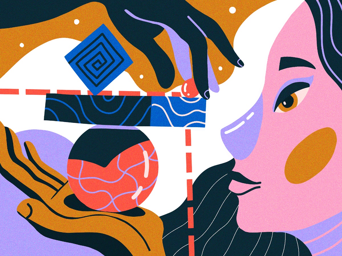
This trend will manifest itself by coloring objects in shades that they are not usually seen in. The aim is to be playful and to generate creative flights of thought in which people could find a moment of solace while being away from the challenging reality.
It is not a secret that last year we spent a lot of time looking at screens. Of course, we did this a lot even before, but in 2020 when meetings and many celebrations were moved to distant online communication platforms, our screen time has increased considerably. During this time, you probably, if just subconsciously, noticed that some colors are easier to view than others. In 2021 these comfortable, easy-on-the-eyes colors will be markedly relevant. Overall, designs made for the comfort of your eyes will be yet another large trend.
This trend entails the creation of elegant, simple designs with natural color palettes that will make looking at them for hours on end from screens of different sizes a lot easier.
There will be a significant increase in the use of calm, muted and soft pastels that create the emotional feeling of safety and assurance.
Another anticipated color trend that we will see in 2021 will be colors that look worn and washed-out – just like your favorite jeans or t-shirt. This trend establishes the use of colors that appear as if faded out over time, where the only thing that’s left are the folding lines that are visible and bright. These colors might not be exciting, but they create a delightful emotional bond with their users. Rough, worn-our textures will also be used in order to make the images and objects look more as if they have stood through the test of time.
Designs based on blocks of color in which you can see shapes from nature is not only a color trend but also one of this year’s most popular packaging design trends. Similar trends have already been observed long before – in the 90s. However, now instead of geometrically precise and distinct shapes, we will see ones that are imperfect, fractured, compressed, and stretched in shape with accompanying colors.
Nature motifs and color schemes will also be popular in identity designs, graphical elements used in various user interfaces (UI), illustrations, and animations.
This trend can be divided into two parts: 1) monochrome palettes with a contrast tone and 2) limited number color palettes. The monochrome palettes are not a new trend – they already became popular in 2020. However, there is a difference between the monochrome palette of 2020 and its 2021 version. If in 2020 monochrome designs were based on several monochrome tones that created the depth and the visual story of the design, then in 2021 designers take these single-color, grey tone designs and supplement them with a single distinct contrasting color. By adding one vivid and brave tone, the design is brought into the world of color without becoming overbearingly colorful.
Both in 2020 and now, our everyday activities have been considerably limited. Color as the most expressive and emotional part of graphic design is now also used for creative experiments – more and more graphic designers and illustrators choose to offer their designs in very limited color options or just in single-color palettes.
All trends evolve in response to the previous year’s trends and events; the same applies to color. Having endured 2020 and rediscovered what is truly important, it is not surprising that we should expect color trends that are oriented towards people and their emotional well-being. Be they light and pale, or warm and saturated, we should use everything we have to lift spirits and spread positive emotions for one another.
Materials from the following sources were used for this compilation of trends:
 Back
Back